About this project Jobbird is a vacancy website where you can create vacancies as a costumer and apply to vacancies as a candidate. The goal of this project was to increase the user experience when navigating through vacancies as a customer, in order to increase conversion rate of vacancies, so that vacancies on Jobbird would get more (succesful) applications.
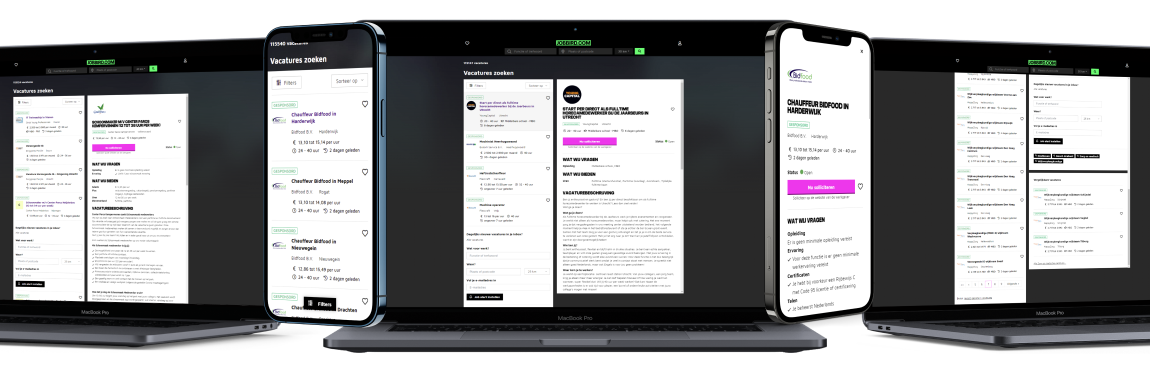
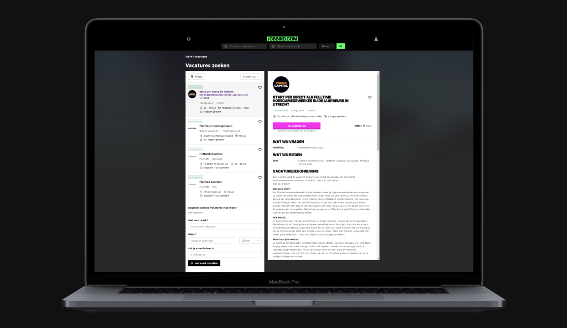
The problem When looking at the vacancy list on the old website, a vacancy in the vacancy list only contained the title, the beginning of the vacancy description, the work location and when the vacancy was published. The vacancy and it’s details were viewed on a seperate vacancy detail page. This meant that you had to go to a different page, everytime you wanted to read through a vacancy. The vacancies also had poor scannability when looking for certain information. Titles had different sizes and information was not presented in a logical order These and many other inconveniences resulted in a low amount of (succesful) applications to vacancies.
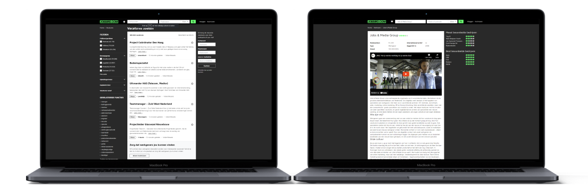
Approach When looking at other vacancy websites such as LinkedIn, Indeed, Monsterboard and Werkzoeken, it was clear that the website could be improved with the help of a two pane. One pane on the left with the vacancy list and one pane on the right with the vacancy details. This gives a better overview of all the content on the website and makes the vacancies more accessible. I joined this project when the idea of the two pane was already established with some early designs already being made. However, there the designs and the user experience still had to be improved before the website could go live. Examples that were changed are: images of company logos, icons that have changed, filters that have been changed and relocated and information that has been added below each vacancy on the vacancy list, such as the salary. Content on the vacancy detail pane, such as “what we offer” and “what we ask” was moved to the top. There were also lots of different titles, with different font sizes and font weights. This has changed in order to improve the visual hierarchy, scannability and the consistency. The big titles also have the same font style as the Jobbird logo, making the website feel more like Jobbird.
My contribution As one of the two UX/UI Designers on this project I was responsible for a part the design process. My contribution consisted of thinking along in the proposition and strategic product decisions and pixel perfect designs. The development project team consisted of a product manager, two UX designers, engineering manager , a CRO team, backend developers and frontend developers.